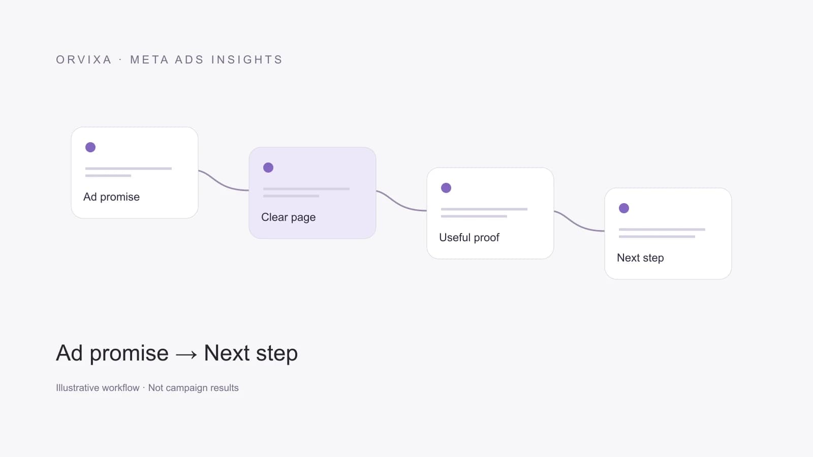
Continue the promise after the click
A landing page is where the advertisement’s promise becomes concrete. Someone clicking for a specific service should not have to search through a crowded company overview to find it. The opening section should explain the offer, who it is for and what happens next. This does not require oversized headings or constant animation. Clarity is a more fundamental requirement than visual spectacle.
If an advertisement promotes appointment software, the page should continue that subject rather than switch to a vague technology slogan. Check that conditions and scope match. Orvixa treats the landing experience as a continuation of the advertising work. This connection is particularly important when different teams create the campaign and the website, because each can look reasonable in isolation while failing to form a coherent journey.
Review the mobile experience properly
A layout that looks orderly on a desktop can become a wall of text on a phone. Check line lengths, button access and form usability. Where possible, use a real device as well as a resized development window. A fixed menu or contact button should not obscure the action the visitor needs to complete. Visual quality and function belong in the same review.
Performance is more than a single score. Large images, unnecessary autoplay video and heavy interactions can delay a useful first experience. Appropriate image dimensions, deferred off-screen content and early access to important information help. But optimisation should not break the page or make essential information disappear. A faster page with a failing form is not a successful improvement, even if a benchmark looks better.
Build trust with real information
Many visitors are meeting the business for the first time. A clear company identity, contact channel, service scope and process explanation therefore matter. Invented testimonials, unverified customer counts and ambiguous badges do not solve a trust problem. When sharing a genuine example, make its context and permission clear. Do not suggest that another customer’s experience guarantees an identical result for the next buyer.
Address practical objections. What is included? What information is required? Is maintenance separate? Does the fee include media spend? These answers can determine whether someone is ready for a conversation. Avoid placing every detail in the opening section; organise information into readable groups. Repeated sales questions are often useful evidence when deciding what a landing page should explain earlier.
Give the page a primary action
Requests to buy, download, subscribe, call and request a quote can compete when they all have equal emphasis. Decide the page’s main purpose. Secondary links do not need to disappear, but visual priority should help visitors choose. A lead generation page may emphasise a form, while a product page may prioritise checkout. Base this hierarchy on the user’s task rather than a familiar design pattern.
Choose form fields with the same discipline. Some services need only enough information to start a conversation; others require technical context to assess suitability. Explain successful submission and the next step. Error messages should identify what needs correction instead of blaming the visitor. These details are not cosmetic. They affect whether paid traffic can complete the action the campaign was designed to encourage.
Change the page to answer a question
Define the problem before redesigning. Are visitors avoiding the form, abandoning a particular field or submitting unsuitable enquiries? Each observation suggests a different investigation. A specific hypothesis, such as unclear service scope, is more useful than a general instruction to increase conversion. Record changes in traffic sources and offers when comparing versions so the redesign is not credited with every movement in results.
A landing page is not a document to finish and forget. Products, offers and customer questions change. Connecting advertising and web work helps keep the pre-click message and the post-click experience aligned. A good page does not say everything to everyone. It provides the information a relevant visitor needs to make a decision, in a form that is accessible, consistent and easy to follow.
Practical exercise
Show the page briefly to someone unfamiliar with your business and ask what is being sold and what the next step is. If their answer differs from your intended message, review the content hierarchy first. This exercise is a practical starting point for finding unclear language, rather than a scientific conversion test. Then complete the form on mobile, test an error and read the success message. Repeat in dark mode if available. Button copy, link contrast and fixed elements affect usability. Evaluate changes through completed tasks as well as screenshots. When visitors understand the service and complete the next step smoothly, the design is doing its fundamental job better.